RESPONSiVE WEB DESiGN | i WANT TO BE THE ViLLAiN
Website design and front end development for an original webcomic, designed to whimsically evoke the feeling of the comic using the color palette and motifs of the main character. The site was built to responsively adapt to the device of the viewer, adjusting to a different layout for desktop, tablet, and smartphone viewing.
View the live site here: marylipp.com/bethevillain
Play with the browser window size to see the site dynamically adjust layouts.
Note: Home, About the Author, Contact, Begin Reading, and Latest Page are the only fully functional pages. Contact and Comments forms are for display only
WiRE FRAMES
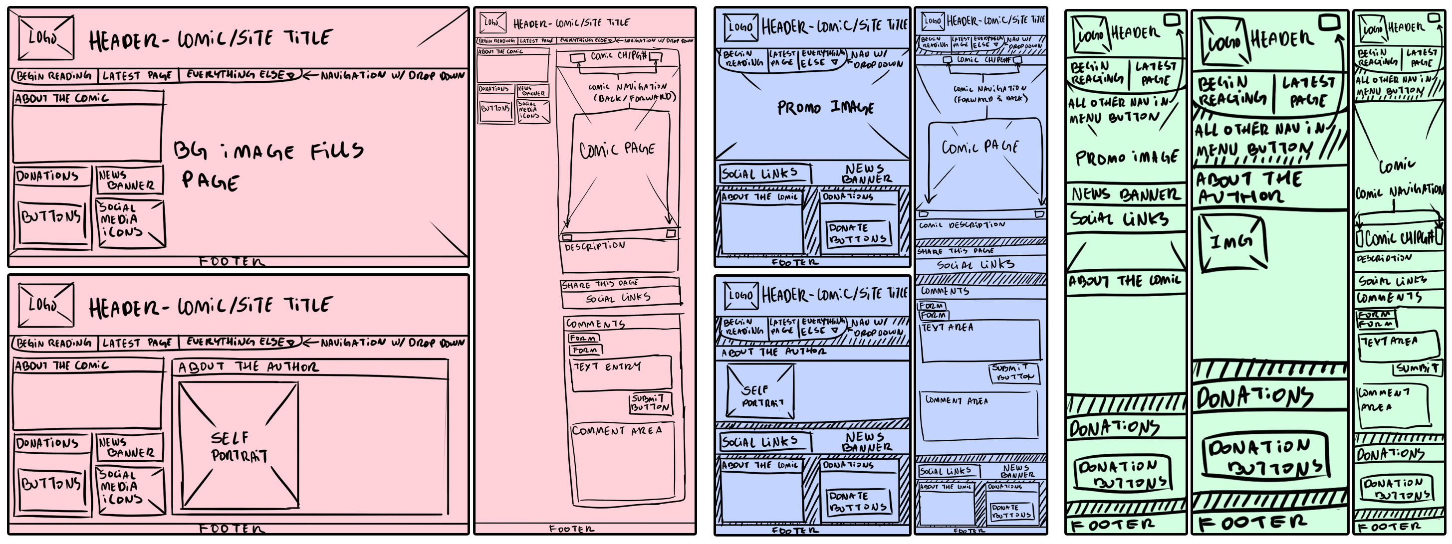
After taking stock of the content that was destineid for the site, the first step was sketching out a series of wireframes to decide on the layout the pages. It was important to me to design from the mobile version first and then work my way up to the desktop version, as I imagined people reading a webcomic would not always be at their home computers. I wanted all key features of the wesbite to be available at all sizes from any device. The following wireframes are for the Home, About the Author, and Comic pages.

MOCKUPS
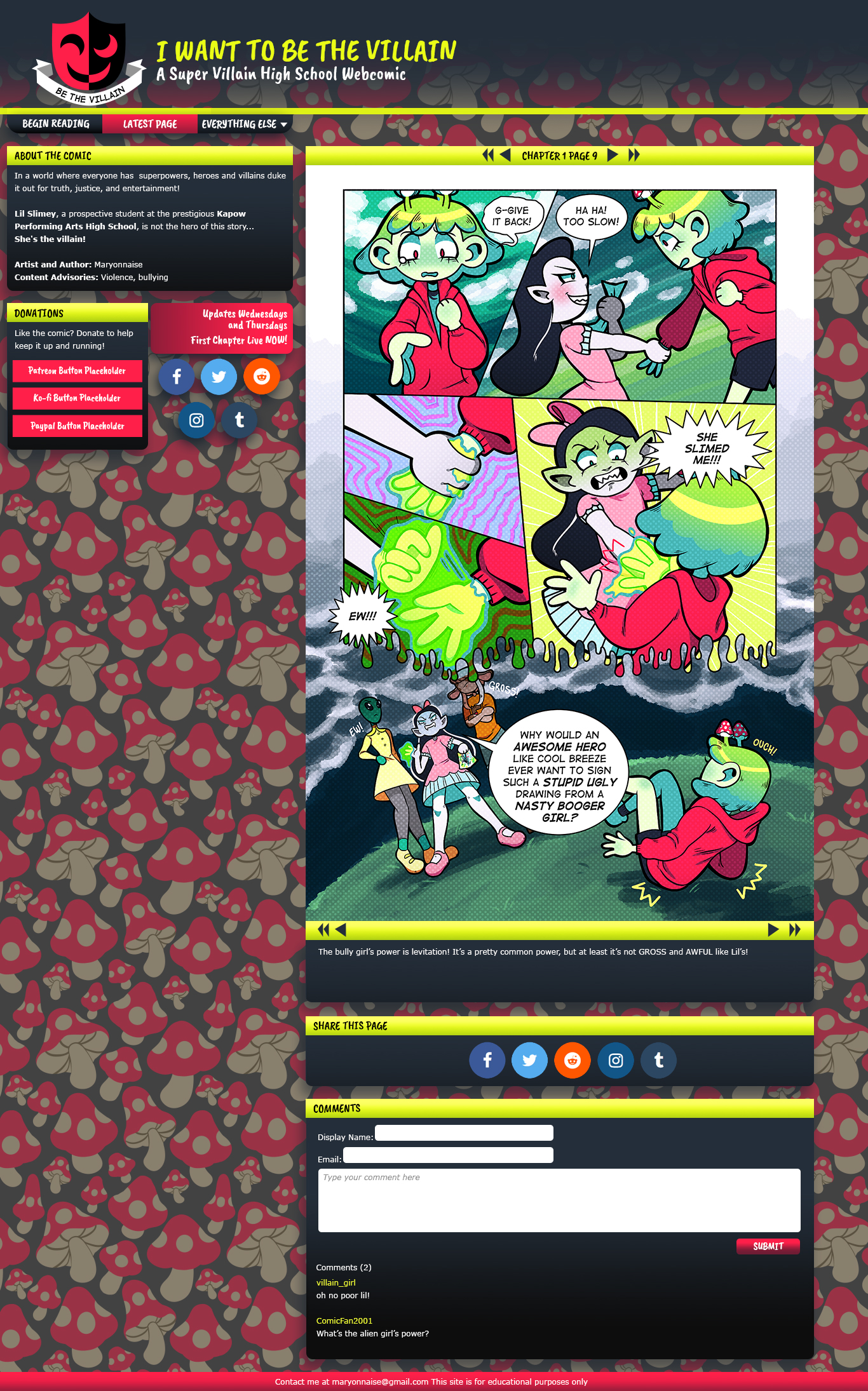
The next step was creating high fidelity mockups to solidify the aesthetic design choices. The colors were chosen based on the main character's color scheme and the comic logo, with the fonts meant to evoke the handlettering of comic books.
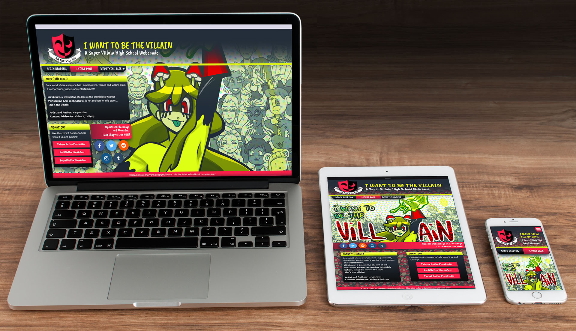
The following images are of the Home page mockup showing the difference between desktop, tablet, and mobile, and the full page designs showing the differences between the Comic pages for all three device types.


